Role: Sr. Product Designer, owning end-to-end UX for the member-facing experience. Worked closely with PM, engineering, and product marketing teams.
Methods: Research, Funnel mapping, Testing — identifying every drop-off point across the upgrade flow
Tools: Figma, MixPanel and Reddit
Deliverables: Full Pro experience flow and Visual content coach feature
Overview
Influenster is a consumer-facing app discovery and review platform. Users review products, share experiences, answer questions, and sometimes receive free products from brands in exchange for honest feedback. It functions as a large community of consumers generating reviews and content about products.
Influenster is Bazaarvoice’s consumer community of 8M+ members, One of the largest product review and sampling platforms globally. Influenster Pro was designed to activate the 80,000+ creators already inside that community who have Instagram Business or Creator accounts (yet no upgrade path),
a verification layer or way for brands to discover them.
I owned the end-to-end member experience, including the upgrade flow, eligibility states, Pro profile, badge system, and funnel edge cases.
Influenster Pro Experience
Problem Statement
- Problem 1: No upgrade path existed
Members with creator level Instagram accounts had no way to signal that identity within Influenster. There was no mechanism to verify them, no dedicated profile state, and no way for the platform to treat them differently from a standard consumer member.
- Problem 2: The social connection was broken for creators
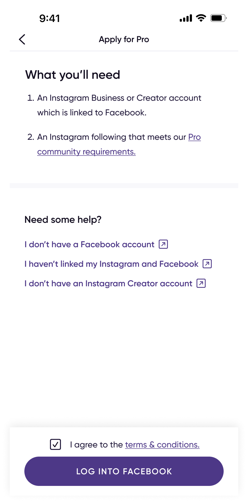
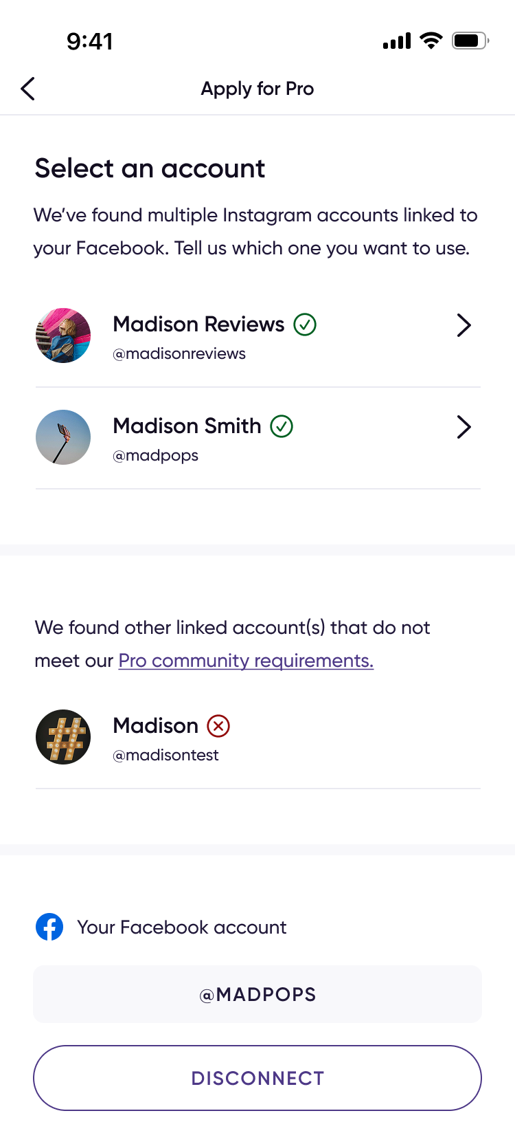
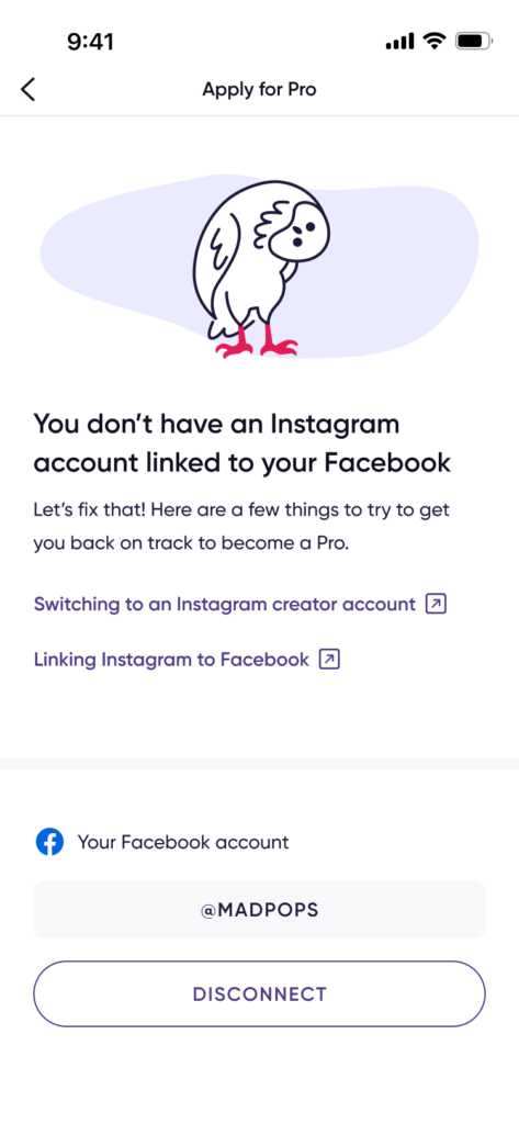
Influenster’s Instagram integration used only the Basic Display API, which could link accounts but not access follower count, engagement, or account type. Verifying creator eligibility required a new Meta Business/Creator API integration, introducing a friction heavy web view handoff that needed careful UX design.
- Problem 3: Creators didn’t know Influenster was for them
Influenster’s core experience: product discovery and consumer profiles signaled that the platform was built for everyday shoppers.
Creators had no clear path to opportunities or visible status, creating a value gap that was as much a UX problem as a marketing one.
Research
Qualitative member research:
Internal research found 85%+ of eligible members (those with Business or Creator IG accounts) expressed interest in becoming verified creators. This shaped the waitlist design, we expected high demand and designed the banner + waitlist to handle it at scale, not as a soft experiment.
Community sentiment analysis — Reddit monitoring:
- Members were nervous about applying, fearing permanent rejection. This shaped the rejection state copy and the re-apply messaging.
- Members were confused by the Facebook requirement for an Instagram connection. This shaped the “Need help?” section added to the application screen.
- Members were actively sharing eligibility data with each other: follower counts, engagement calculations. This validated that the value prop was landing clearly.
Design Decisions
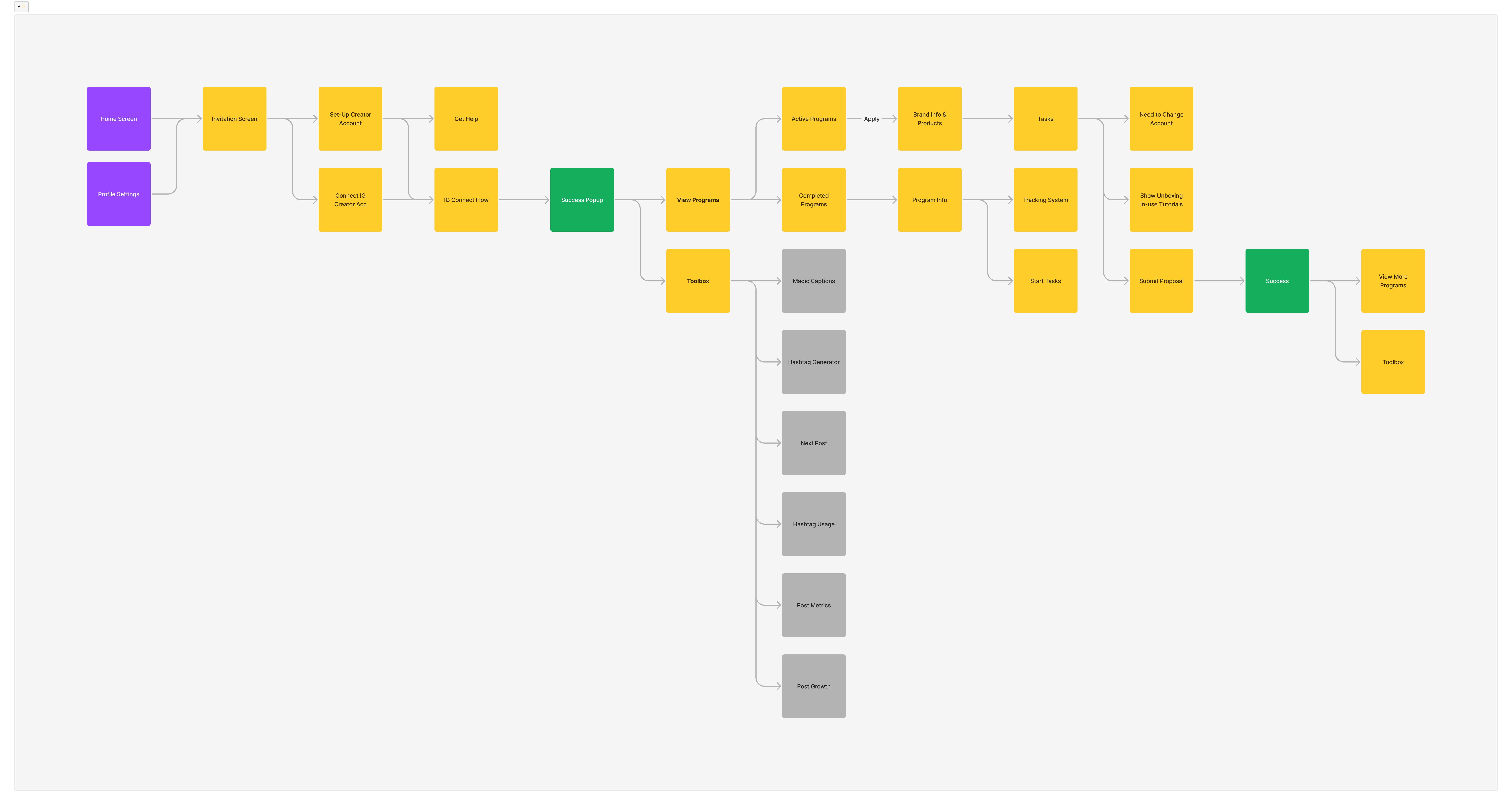
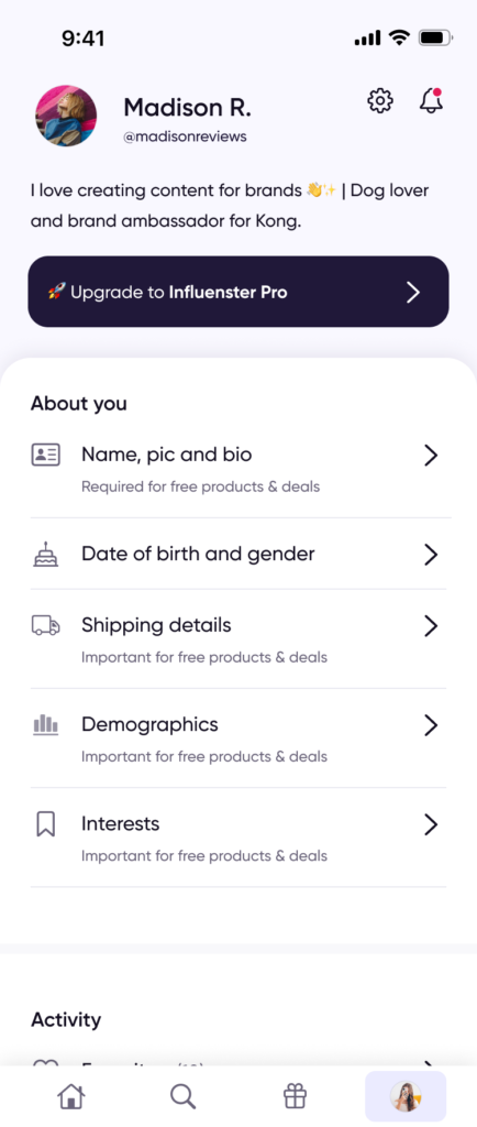
- Home feed banner as primary entry point
Placed the Pro invite banner at the top of the home feed for eligible members not buried in settings. Post launch data confirmed this drove 30% higher conversion vs. the profile page, validating the placement decision.
- Pro badge in two community contexts
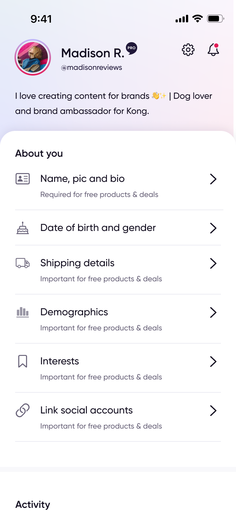
Designed the badge to appear on the Pro member’s profile and beside their username on product reviews, So Pro status was visible across the community, not just to the member.
- Clear rejection messages
62% of launch rejections were follower count only, Cases that almost passed.
I designed the rejection screen to surface the specific reason, reassure members they could re-apply anytime, and reduce the anxiety that community research had flagged pre-launch.
- Design system that could absorb eligibility changes without redesign.
Given uncertainty around launch criteria (follower count, engagement rate),
I designed eligibility screens to be content driven rather than hardcoded. When requirements changed in week 2, only the copy and logic needed updates, not the UI. This paid off immediately when the PM revised requirements based on rejection data.
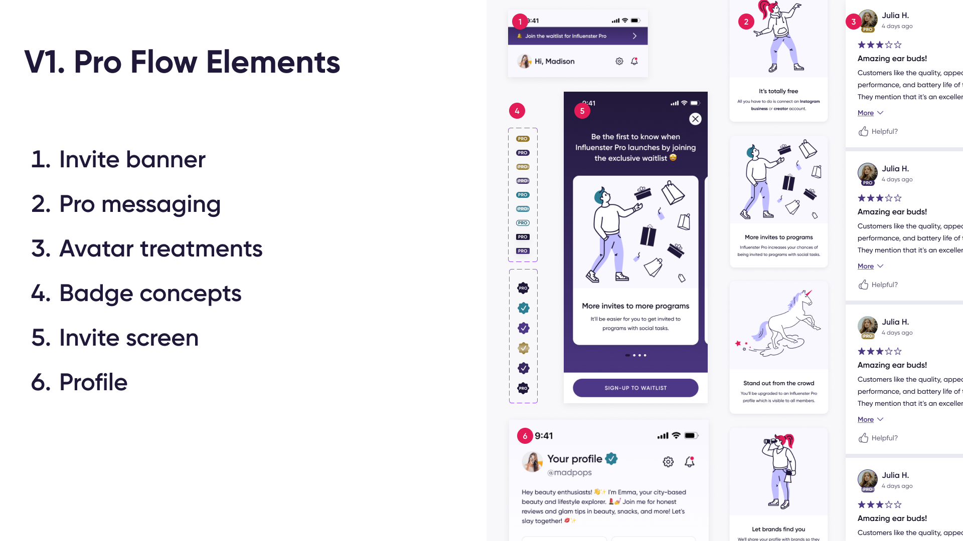
Information Architecture
I mapped the full upgrade system before touching UI, defining every entry point, user state, and branching outcome across the Pro funnel.
Starting from the existing Influenster app structure, I identified where the Pro experience needed to inject itself, how each member state would route through the system, and where dead ends existed that could silently trap users. The IA became the source of truth for both design and engineering, ensuring every edge case had a resolved destination before any screen was built.
Design Work
Pro account entry point..
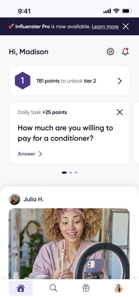
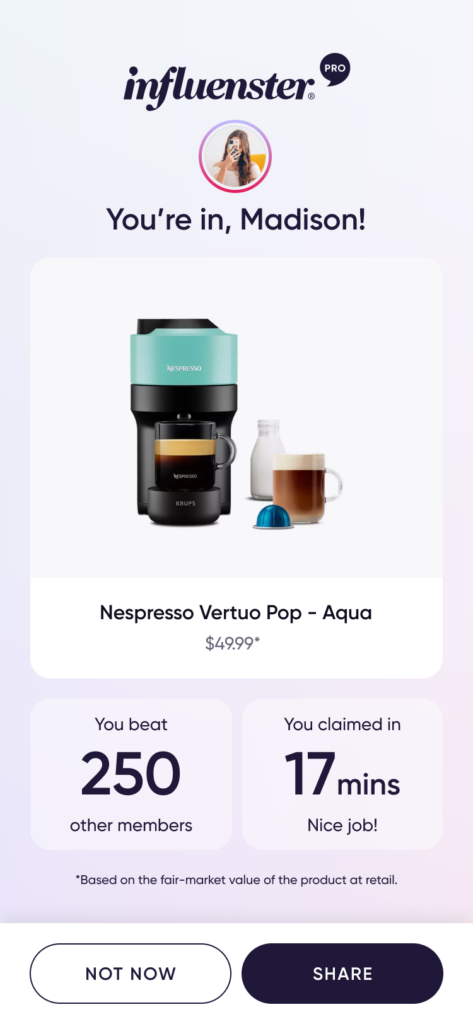
Pro application flow..
Design Impact
By end of launch week, Reddit communities had independently worked out the eligibility requirements and were sharing their follower counts to help each other qualify, a strong signal that the value prop and flow were clear enough to travel without explanation.
- 112 Pro members in the first 2 weeks from zero at launch.
- 115 attempted Facebook login, 98 completed it successfully, an 85% Auth completion rate.
- ~5 minute average upgrade completion time for a multi-step Auth funnel
- Home feed banner: 30% higher conversion than profile page, informing future prioritisation of entry points.
- Eligibility algorithm iterated in week 2 based on real data — design supported rapid criteria changes without a full flow redesign.
Visual Content Coach Feature
Problem Statement
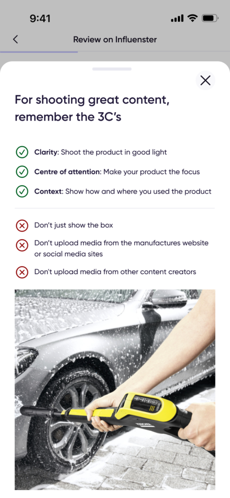
Review image engagement had fallen 70% in a year, 580K likes to 171K. Around the same time, a major client filed a formal escalation, scoring content quality 2 out of 10 and citing reviews that showed nothing but a picture of the box.
The cause wasn’t member apathy. It was that Influenster gave members almost no specific help. A static educational flow, Also every product on the platform showed the same four example images, irrelevant for anything outside that narrow set, and useless for niche products where members genuinely didn’t know what to shoot.
The impact extended beyond a single client: a ~$50M reviews-only revenue stream and a strategic social commerce initiative both depended on increasing the volume of high quality, reusable member images.

Design Strategy
I didn’t start from “let’s add AI.” I started from what was actually broken: members needed product specific direction at the moment they were about to shoot, and the existing static guidance couldn’t scale to that.
Influenster had already proven a version of this pattern worked — Content Coach, a feature that generates topic prompts for review text, had shipped and measurably improved review quality. That gave me a validated mechanism to extend, rather than an unproven bet: use generative AI to turn “here are a generic examples” into “here are a specific ideas for this product.”
I intentionally kept the MVP focused. I explored AI-generated reference images and automated photo validation, but excluded both because they added significant technical complexity without helping validate the core product risk. Instead, I shipped context-specific guidance first—the simplest solution capable of testing. This enabled faster learning before investing in more complex automation.
Design Decisions
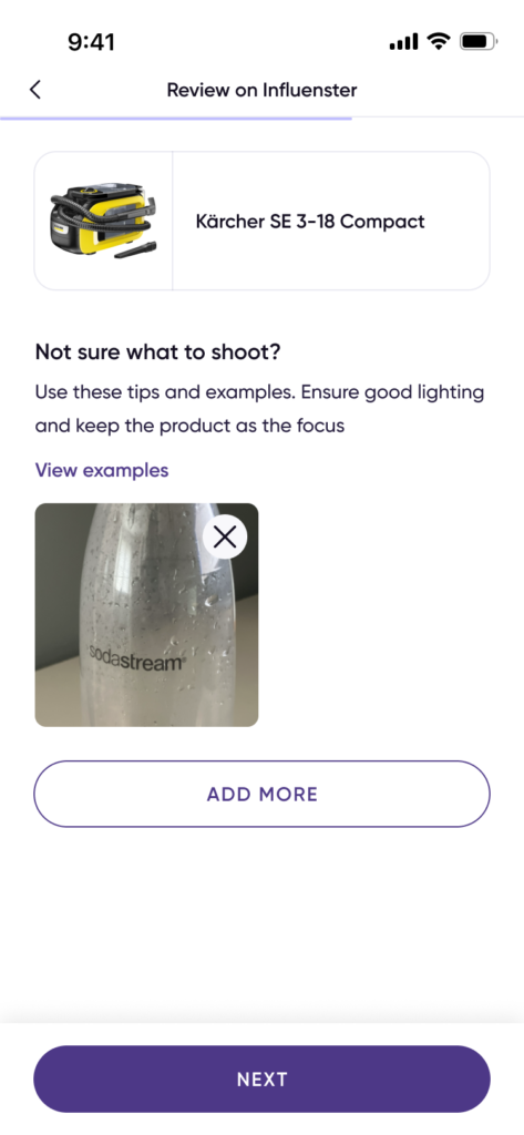
- Guidance lives where the friction is. Ideas and a reference image appear on the existing Upload Media screen and again on the in-app camera with no new screen or step added.
- I tested two motivational framings, not one. One leans on personal help (here’s some ideas for quality content), the other on community contribution (help our community find their next favourite thing).
Rather than assume, I designed both and let the pilot decide. - I chose ideas over enforcement. A stakeholder proposed tying quality to campaign eligibility. The pilot needed to answer a simpler question first: does guidance alone move quality, before adding consequences.
- I treated the AI’s output as a design surface: Tone, length and boundaries were product calls: No generic advice, no competitor mentions, one scannable idea at a time. I also designed a fallback for AI refusals, so a declined product never breaks the screen.
- I split the vision to ship the achievable half. AI-generated reference photos weren’t reliable yet, so I kept AI for the ideas and used a small curated image set for the reference photo — shipping the strong half instead of waiting on both.
Design Approach
Member reaches Upload Media and sees a specific prompt “Not sure what to shoot?” plus a swipeable card with a concrete idea for this product, not a generic tip.
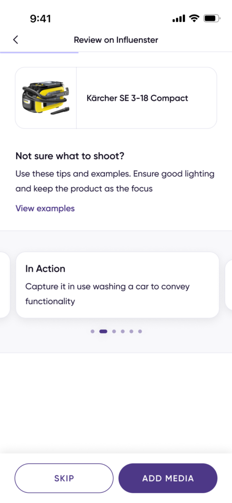
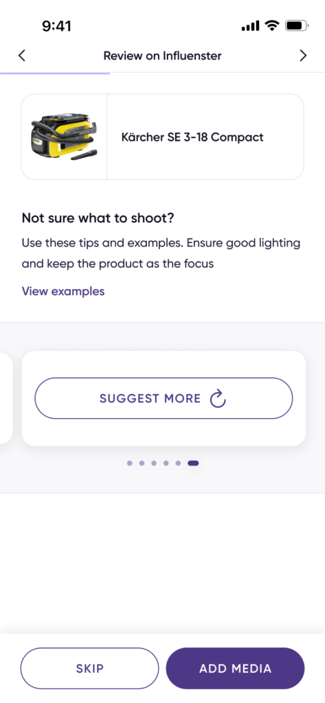
View examples” opens the 3C’s, now paired with explicit Don’ts, closing a gap flagged in research: members were told what to do, never what to avoid.
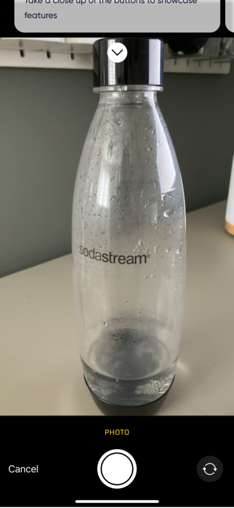
If the member shoots in-app, the same idea follows them onto the camera screen as a dismissible overlay, guidance at the exact moment of the shot, not before it.
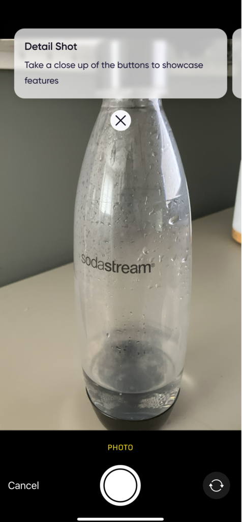
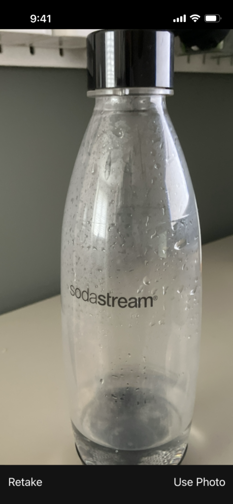
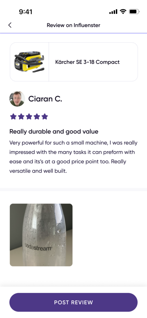
I designed the guidance as an optional layer, not a required step. Members could use it or skip it without changing the review flow, ensuring better content came from support rather than added friction.
Results

Following launch, Content Coach was used in over 35,000 reviews, resulting in measurable improvements across content quality and user engagement.
- 86.9% of nearly 3,000 surveyed members found Content Coach helpful
- +23.6% increase in average review length
- +12 characters increase in average review body length
- +7% increase in reviews with attached media
- Internal stakeholders reported that the feature’s positive impact exceeded the quantitative metrics
- The solution improved review quality for members while helping brands generate higher-quality user-generated content for campaigns